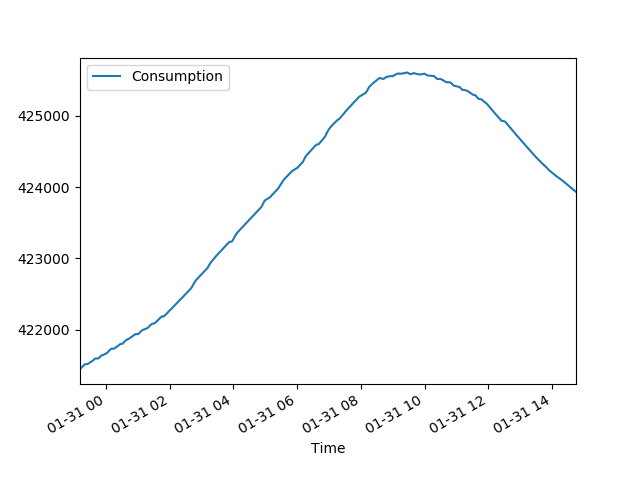
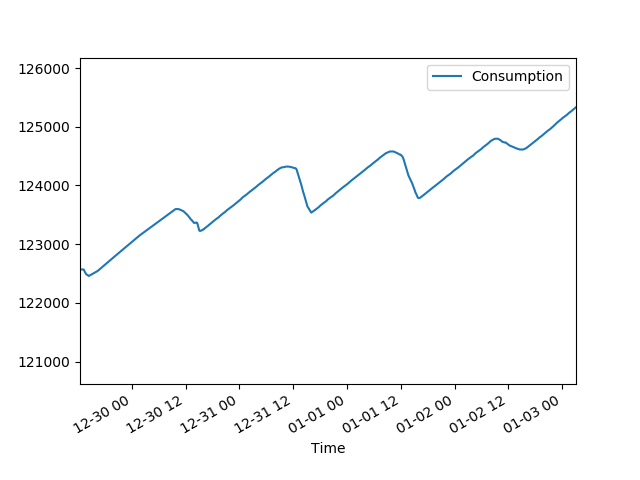
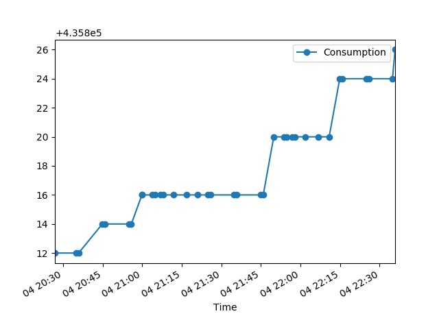
Today I successfully created a pandas DataFrame in rtlamrvis.py containing the rtlamr data, and created line plots for individual meter IDs. Scatter plots aren’t working, but a line still shows what’s going on. Below are a few sample plots, including two of data I previously hypothesized is from a power meter on a building with solar panels.
I’m really pleased that I finally had some success plotting the rtlamr data. It took a long time to find a pandas plotting example that I could understand. Most of the examples I found were either obviously not written for a beginner in mind, or assumed the reader would be using Jupyter notebooks. My code was executing without errors but I still wasn’t seeing any plots…until I found that magic incantation:
matplotlib.pyplot.show()
Next steps:
- Figure out how to plot multiple data sets on the same axes
- Calculate and plot the rate of consumption instead of the consumption counter value
- Get scatter plots working